Best Practices for Overlay Design on Live Streams
Learn how to design professional, eye-catching overlays for your live stream. Tips on logos, text, audio visualizers, color schemes, and layout that keep viewers engaged.
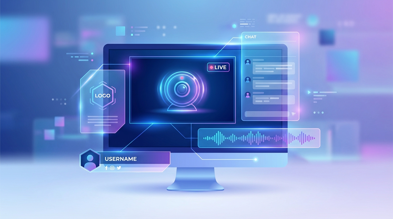
Why Overlays Matter
Overlays are the visual elements layered on top of your stream content: logos, text, borders, audio visualizers, and more. They serve three critical purposes:
Branding: overlays establish your channel's visual identity and make your stream instantly recognizable
Information: they communicate useful details like what's currently playing, your channel name, or social media handles
Professionalism: well-designed overlays signal quality and encourage viewers to stay longer and subscribe
The difference between a stream with no overlays and one with thoughtful design is dramatic. Let's cover how to get it right.
The Golden Rule: Less Is More
The most common mistake in overlay design is adding too much. Your video content should always be the star. Overlays should enhance, not compete.
Aim for 2-4 overlay elements maximum. A typical professional setup includes:
A logo or watermark
A now-playing or information display
One accent element (audio visualizer, border, or decorative graphic)
If you find yourself adding a fifth or sixth element, step back and ask which ones are truly necessary.
Logo and Watermark Design
Placement
The most common logo positions:
Top-right corner: the standard for most streams and TV channels
Top-left corner: works well if your now-playing display is on the right
Bottom-right corner: less common but effective
Avoid placing your logo in the center of the screen or directly over the main content area.
Size
Your logo should be:
Small enough to not distract from the content (roughly 5-10% of the screen width)
Large enough to be readable on mobile devices
Consistent across all your streams
Opacity
A semi-transparent logo (60-80% opacity) looks more professional than a fully opaque one. It says "this is my channel" without screaming it.
File Format
Use PNG with transparency so only your logo shows, not a white or colored box behind it
Use SVG if available for the sharpest rendering at any size
Avoid JPG for logos since it doesn't support transparency
Text Overlay Best Practices
Readability First
Text that viewers can't read is worse than no text at all. Follow these rules:
Contrast: light text on dark backgrounds, or dark text on light backgrounds. If your video content varies, add a semi-transparent background behind the text
Font size: minimum 24px equivalent for body text, 36px+ for titles. Remember that many viewers watch on mobile
Font choice: clean, sans-serif fonts (like Inter, Roboto, or Open Sans) are most readable on screens. Avoid decorative or script fonts for information text
Line length: keep text short. One or two lines maximum
Background Panels
Adding a semi-transparent background panel behind text dramatically improves readability:
Dark panel (black at 50-70% opacity) with white text works on any background
Colored panel matching your brand colors adds personality
Rounded corners on panels look modern and polished
Blur effect behind text (if supported) creates a premium look
Common Text Overlays
Channel name/tagline: short, always visible
Now Playing: automatically updates with current content
Social media handles: @yourhandle on relevant platforms
Call to action: "Subscribe" or "Join the community"
Schedule info: "New content every Monday" or service times for churches
What to Avoid
Too much text: if it takes more than 2 seconds to read, it's too long
All caps for long text: harder to read than mixed case
Tiny font sizes: if you have to squint, so will your viewers
Clashing colors: neon green text on a red background is not a good look
Audio Visualizer Design
Audio visualizers are essential for music streams and add visual interest to any audio-heavy content.
Choosing a Style
Bar visualizer: classic, clean, works with any aesthetic
Waveform: organic, flowing look
Circular: modern, eye-catching centerpiece
Minimal dots: subtle, doesn't dominate the screen
Color Coordination
Match your visualizer colors to your overall brand:
Lo-fi streams: soft purples, blues, pinks
EDM/electronic: vibrant neons, electric blue, hot pink
Jazz/classical: warm golds, deep reds, cream
Nature/ambient: greens, earth tones, ocean blues
Positioning
Bottom of screen: most common, doesn't obstruct the main visual
Center: works when the visualizer IS the main visual (music-only streams)
Side panel: creative option for streams with a specific layout
Size
The visualizer should be prominent enough to be visually engaging but not so large that it overwhelms the background. Typically 15-25% of the screen height works well when placed at the bottom.
Color Scheme Guidelines
Pick a Palette
Choose 2-3 colors that define your stream's visual identity:
Primary color: your main brand color, used for the most prominent elements
Secondary color: a complementary color for accents
Neutral: white, black, or gray for text and backgrounds
Color Harmony
Use color theory to create pleasing combinations:
Complementary: colors opposite on the color wheel (blue + orange, purple + yellow)
Analogous: colors next to each other (blue + teal + green)
Monochromatic: different shades of one color (light blue, medium blue, dark blue)
Consistency
Use the same colors across:
Your stream overlays
Your YouTube thumbnail
Your channel banner
Your social media profiles
This builds a recognizable brand that viewers associate with your content.
Layout and Composition
Safe Zones
Not all of your stream is visible on every device and platform. Keep important elements within the safe zone:
Outer 10%: may be cropped on some devices or platforms
Center 80%: visible on virtually all screens
Critical elements (text, logo): keep within the center 80%
This is especially important if you multistream to platforms with different aspect ratios (e.g., YouTube 16:9 and TikTok 9:16).
Visual Balance
Distribute overlay elements to create visual balance:
Don't cluster everything in one corner
If your logo is top-right, put your now-playing display bottom-left
Leave the center of the screen clear for your main content
Breathing Room
Give each element space:
Don't place overlays right at the edge of the screen
Leave padding between elements
Allow your video content to "breathe" without feeling cramped
Platform-Specific Considerations
YouTube
YouTube's player controls appear at the bottom of the screen. Avoid placing critical overlays in the bottom 10%
The live badge appears in the top-left. Consider this when placing your logo
Thumbnails are important for discovery, so make sure your stream looks good as a static image too
Twitch
Twitch chat often appears on the right side. If viewers use theater mode, your right-side overlays may compete with chat
Twitch's player controls are at the bottom
Consider Twitch's darker UI when choosing colors
TikTok
TikTok's UI elements (likes, comments, share buttons) appear on the right side
The username and description appear at the bottom
Keep overlays in the left and center areas for vertical streams
Overlay Design for Specific Niches
Music/Lo-Fi Streams
Audio visualizer as the centerpiece
Now-playing display is essential
Minimal other elements to maintain the chill aesthetic
Soft, muted colors
Kids Channels
Bright, colorful overlays
Fun, rounded fonts
Animated elements add energy
Channel logo should be friendly and recognizable
Gaming
Clean, modern design
Webcam placeholder if applicable
Game info or category display
Neon or bold accent colors
Educational/Professional
Clean, minimal design
Topic or lesson title display
Institutional logo
Neutral, professional colors
Church/Faith
Warm, inviting colors
Church logo and name
Service times or event info
Scripture verse display (rotating)
Common Mistakes to Avoid
Overcrowding: too many elements competing for attention
Poor contrast: text that's hard to read against the video
Inconsistent branding: different colors and fonts across streams
Ignoring mobile viewers: elements too small to see on phones
Covering important content: overlays blocking the main video
Using low-resolution images: blurry logos look unprofessional
Forgetting about platform UI: overlays hidden behind YouTube or TikTok controls
No hierarchy: every element the same size and prominence, creating visual chaos
Quick Start: Three Overlay Templates
Template 1: Minimal Clean
Logo (top-right, 70% opacity)
Now Playing (bottom-left, dark background panel)
That's it. Clean and professional.
Template 2: Music Stream
Audio visualizer (bottom, full width)
Now Playing (bottom-left, above visualizer)
Logo (top-right, subtle watermark)
Template 3: Content Channel
Logo (top-right)
Channel name/tagline (top-left, small text)
Now Playing or topic (bottom-left, background panel)
Subscribe reminder (bottom-right, small)
Next Steps
Using the Overlay and Composition Editor: hands-on guide to creating overlays in playout.video
Create a Lo-Fi Music Live Stream in 5 Minutes: apply these tips to a music stream
How to Run a 24/7 Kids Channel on YouTube: overlay tips for kids content
Stream Quality Settings: ensure your overlays look sharp at the right resolution